
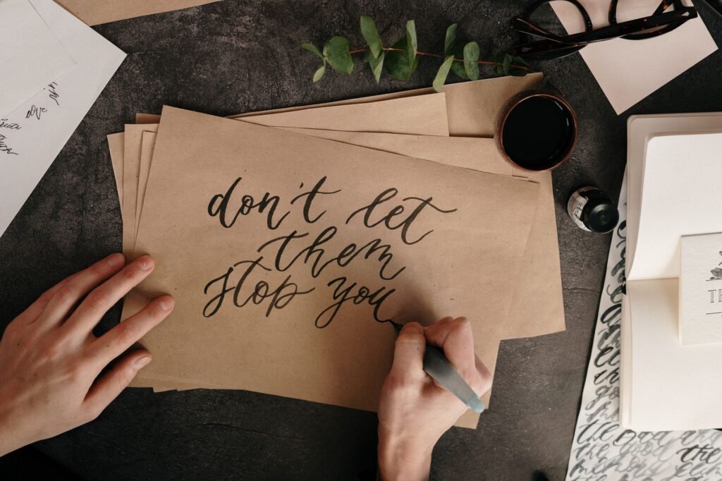
Choose one script, buy smooth paper and a guide sheet, then spend your first weeks on basic strokes rather than letters. Every alphabet is built from a handful of repeated shapes, so drilling those shapes is what produces consistency later. Skipping them is the usual reason progress stalls.
Pick one script and stay there
Switching scripts every week feels like variety and reads as no progress. Three common starting points:
- Modern brush calligraphy. Done with a brush pen, forgiving, popular, and quick to look good. Pressure control is the whole skill.
- Copperplate or Spencerian. Pointed nib and ink, steep slant, very structured. Slow to start, extremely rewarding.
- Italic or foundational hand. Broad edge nib held at a fixed angle. The thickness comes from the angle rather than from pressure, which some people find far easier.
If you are undecided, start with a broad edge italic. The fixed pen angle removes one variable while you learn letter proportions.
What to buy, and what not to
| Item | Beginner choice | Why it matters |
|---|---|---|
| Paper | Smooth laser or marker paper | Textured paper shreds nibs and frays brush tips |
| Tool | One brush pen or one broad nib | More tools means less repetition per tool |
| Ink | Basic black calligraphy ink | Waterproof and shimmer inks clog while learning |
| Guide sheet | Printed slant and height lines | Consistency comes from lines, not from talent |
| Posture aid | Rotate the paper, do not twist your wrist | Slant is set by paper angle |
Prices and available brands change constantly, so check current listings at an art supply retailer rather than trusting an old recommendation. New nibs often have a factory coating; a quick wipe with soap and water helps ink stick.
A practice routine that actually builds skill
- Warm up with five minutes of basic strokes. Upstrokes, downstrokes, overturns, underturns, compound curves, ovals, and ascender loops. These seven shapes build most scripts.
- Move the whole arm, not the fingers. Fingers produce cramped, wobbly lines. Your forearm should slide on the desk.
- Go slower than feels natural. Calligraphy is drawn, not written. Speed comes much later and arrives on its own.
- Drill one letter group per session. Group letters that share a shape, such as a, d, g, and q, which all begin with the same oval.
- Write a full word only at the end of the session, then compare letter heights against your guide lines.
- Date every practice page and keep them. Progress in calligraphy is invisible day to day and obvious across a month.
Fifteen focused minutes daily beats two hours on a Sunday. The skill is motor memory, and motor memory responds to frequency.
The mistakes that hold beginners back
Pressing hard on the upstroke is the most common one with a pointed nib, and it is what causes ink splatter and snagged paper. Upstrokes should be feather light and thin, downstrokes carry the pressure.
Two others worth naming. Working without guide lines, which makes inconsistent slant almost guaranteed, and judging your work against finished pieces posted online rather than against your own page from last month. Those pieces are usually the best of many attempts, often refined digitally.